The Background Should Support the Jewelry, Not Compete with It
Color in jewelry presentation is more than a decorative decision. The relationship between the display background, cabinet finish, and merchandise affects how customers perceive the pieces and the atmosphere around them.
The same ring can appear different against a dark or light background because the contrast around its outline and details changes. Choosing jewelry display case colors therefore requires more than following a popular finish trend. The color must work with the actual merchandise.
Research published in the Journal of Environmental Design Innovation found that interior showcase color and light color temperature influenced participants' perceptions of jewelry and display atmosphere. The study was conducted under specific experimental conditions, so its findings should not be treated as a universal rule for every product.
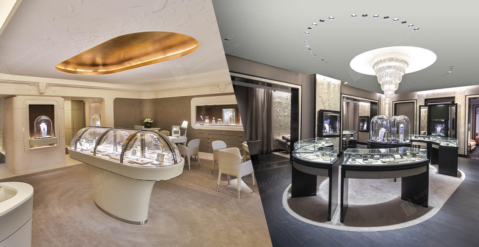
Dark Backgrounds Create Definition and Atmosphere
Black, charcoal, and selected deep brown finishes can create a strong visual boundary around jewelry. They may suit displays that emphasize silhouettes, metalwork, or intricate settings.
However, a dark background is not automatically the best choice. If the merchandise itself is dark or depends on subtle outline details, an excessively dark interior can reduce visual separation.
The decision should be based on the jewelry, product spacing, and surrounding store environment—not on the assumption that black always looks more luxurious.
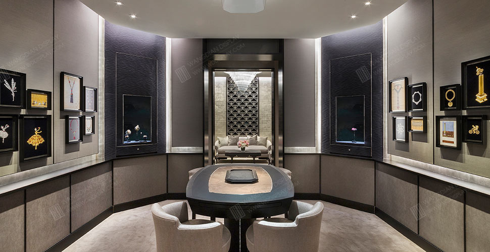
Light Backgrounds Create a Cleaner Presentation
White, ivory, and light gray can create a bright, restrained setting that helps customers examine product outlines and details.
Yet light finishes have their own limitations. Too many similar pale surfaces may flatten the visual hierarchy, while some finishes can reveal marks or wear more easily over time.
Effective jewelry showcase color combinations should therefore be judged not only by their appearance when new, but also by how they perform in a real retail environment.
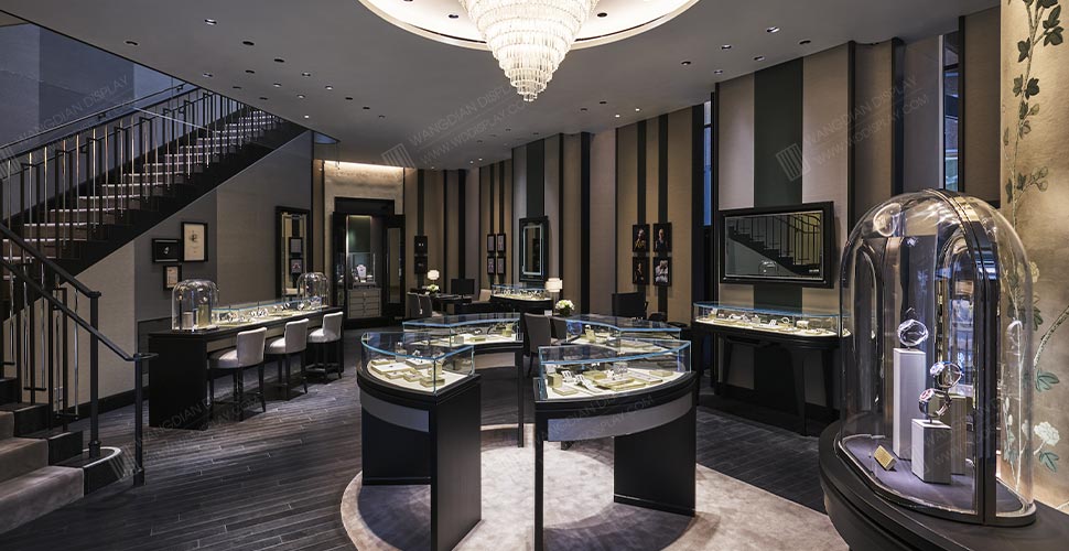
Brand Colors Do Not Need to Cover Every Surface
A brand with a distinctive color palette does not necessarily need to apply its signature color to every part of the showcase.
The color can appear in selected cabinet surfaces, decorative details, metal finishes, or other identifying elements, while the interior remains visually controlled enough to support the jewelry.
Brands with several collections may also use different interior backgrounds for selected product groups while retaining consistent proportions and signature design details across the store.
Approve Colors with Real Samples
Colors displayed on a monitor may differ from actual materials under store lighting, particularly when surface texture and finish are involved.
For premium custom projects, physical finish samples should be reviewed under lighting conditions close to those of the intended store. Testing the sample with representative jewelry can reveal issues that a rendering may not show.
Wangdian Display combines professional design and R&D capabilities with in-house manufacturing to develop customized display solutions for premium brands.
For brands seeking a consistent visual identity, luxury jewelry showcase customization should consider the cabinet finish, interior background, merchandise, and surrounding space as one coordinated decision.
There is no single correct color for every jewelry display case. The right choice is the one that complements the merchandise, supports the brand, and remains convincing in the actual retail environment.
+86 19195580698
info@wddisplay.com
+86 19195580698